For the best viewing experience please access this manual from https://selkamand.github.io/ggoncoplot/articles/manual.html.
Input data
The input for ggoncoplot is a data.frame/data.table/tibble with 1 row per mutation in cohort and columns describing the following:
Gene Symbol
Sample Identifier
(optional) mutation type
(optional) tooltip (character string: what we show on mouse hover over a particular mutation)
These columns can be in any order, and named anything. You define the mapping of your input dataset columns to the required features in the call to ggoncoplot.
Finding public datasets
The tidyTCGA package provides public tabular cancer datasets. ggoncoplot is flexible with input data; you can use MAF files or any other tabular mutation-level datasets by specifying the columns for sample identifiers and gene names.
Minimal example
# TCGA GBM dataset from TCGAmuations package
gbm_csv <- system.file(package='ggoncoplot', "testdata/GBM_tcgamutations_mc3_maf.csv.gz")
gbm_df <- read.csv(file = gbm_csv, header=TRUE)
gbm_df |>
ggoncoplot(
col_genes = 'Hugo_Symbol',
col_samples = 'Tumor_Sample_Barcode'
)Colour by mutation type
Colour by mutation by specifying col_mutation_type
# TCGA GBM dataset from TCGAmuations package
gbm_csv <- system.file(package='ggoncoplot', "testdata/GBM_tcgamutations_mc3_maf.csv.gz")
gbm_df <- read.csv(file = gbm_csv, header=TRUE)
gbm_df |>
ggoncoplot(
col_genes = 'Hugo_Symbol',
col_samples = 'Tumor_Sample_Barcode',
col_mutation_type = 'Variant_Classification'
)
#>
#> ── Identify Class ──
#>
#> ℹ Found 9 unique mutation types in input set
#> ℹ 0/9 mutation types were valid PAVE terms
#> ℹ 0/9 mutation types were valid SO terms
#> ℹ 9/9 mutation types were valid MAF terms
#> ✔ Mutation Types are described using valid MAF terms ... using MAF paleteControl which genes are shown
Show top [n] genes
Show the 4 most frequently mutated genes using topn
argument
gbm_df |>
ggoncoplot(
col_genes = 'Hugo_Symbol',
col_samples = 'Tumor_Sample_Barcode',
col_mutation_type = 'Variant_Classification',
topn = 4
)
#>
#> ── Identify Class ──
#>
#> ℹ Found 9 unique mutation types in input set
#> ℹ 0/9 mutation types were valid PAVE terms
#> ℹ 0/9 mutation types were valid SO terms
#> ℹ 9/9 mutation types were valid MAF terms
#> ✔ Mutation Types are described using valid MAF terms ... using MAF paleteExclude specific genes
Use the genes_to_ignore argument to filter out specific
genes, such as TTN and MUC16.
gbm_df |>
ggoncoplot(
col_genes = 'Hugo_Symbol',
col_samples = 'Tumor_Sample_Barcode',
col_mutation_type = 'Variant_Classification',
topn = 10,
genes_to_ignore = c("TTN", "MUC16")
)
#>
#> ── Identify Class ──
#>
#> ℹ Found 9 unique mutation types in input set
#> ℹ 0/9 mutation types were valid PAVE terms
#> ℹ 0/9 mutation types were valid SO terms
#> ℹ 9/9 mutation types were valid MAF terms
#> ✔ Mutation Types are described using valid MAF terms ... using MAF paleteYou can use packages like somaticflags to get lists of genes you might want to filter out.
Gene subset
lets only show TP53 and TERT
gbm_df |>
ggoncoplot(
col_genes = 'Hugo_Symbol',
col_samples = 'Tumor_Sample_Barcode',
col_mutation_type = 'Variant_Classification',
genes_to_include = c('TP53', 'TERT'),
)
#>
#> ── Identify Class ──
#>
#> ℹ Found 9 unique mutation types in input set
#> ℹ 0/9 mutation types were valid PAVE terms
#> ℹ 0/9 mutation types were valid SO terms
#> ℹ 9/9 mutation types were valid MAF terms
#> ✔ Mutation Types are described using valid MAF terms ... using MAF paleteControl what samples are shown
The show_all_samples argument will add samples that
don’t have mutations in the selected genes to the plot.
gbm_df |>
ggoncoplot(
col_genes = 'Hugo_Symbol',
col_samples = 'Tumor_Sample_Barcode',
col_mutation_type = 'Variant_Classification',
show_all_samples = TRUE
)
#>
#> ── Identify Class ──
#>
#> ℹ Found 9 unique mutation types in input set
#> ℹ 0/9 mutation types were valid PAVE terms
#> ℹ 0/9 mutation types were valid SO terms
#> ℹ 9/9 mutation types were valid MAF terms
#> ✔ Mutation Types are described using valid MAF terms ... using MAF paleteNote that if you supply a metadata table, by default samples lacking
ANY mutations at all will still not be shown. You can include these
samples by setting metadata_require_mutations = FALSE but
this isn’t recommended unless you’re sure the sample truly has no
mutations at all in the dataframe.
Customise tooltips
Use the col_tooltip argument to indicate which column of
your input dataframe should be used as a custom tooltip.
# Add a tooltip column to data.frame
gbm_df[["tooltip"]] <- with(gbm_df, paste0(Chromosome, ":", Start_Position, " ", Reference_Allele, ">", Tumor_Seq_Allele2))
# Generate oncoplot
gbm_df |>
ggoncoplot(
col_genes = 'Hugo_Symbol',
col_samples = 'Tumor_Sample_Barcode',
col_mutation_type = 'Variant_Classification',
col_tooltip = 'tooltip' # We'll specify a custom tooltip based on our new 'tooltip' column
)
#>
#> ── Identify Class ──
#>
#> ℹ Found 9 unique mutation types in input set
#> ℹ 0/9 mutation types were valid PAVE terms
#> ℹ 0/9 mutation types were valid SO terms
#> ℹ 9/9 mutation types were valid MAF terms
#> ✔ Mutation Types are described using valid MAF terms ... using MAF paleteNote tooltips are html, so if you want to insert a break, just paste
in <br>.
Similarly, if you want to make text in the tooltip bold, try
"<b>text_to_bold<\b>".
Note that where a single sample has multiple mutations in a gene, are represented as one tile in oncoplot, tooltip for each mutation are shown (newline delimited).
Add pathway annotations
We can also add pathway information to the oncoplot by supplying a simple 2-column data.frame.
Currently the default order of pathways and genes in the plot are based on their order of appearnce in the pathway data.frame. Future versions of ggoncoplot will support data-based sorting. Any genes missing from the oncoplot will be displayed under an ‘Other’ pathway at the very bottom of the plot.
path_pathways <- system.file("testdata/GBM_tcgamutations_mc3.pathways.csv", package = "ggoncoplot")
pathways_df <- read.csv(path_pathways)
gbm_df |>
ggoncoplot(
col_genes = 'Hugo_Symbol',
col_samples = 'Tumor_Sample_Barcode',
col_mutation_type = 'Variant_Classification',
pathway = pathways_df
)
#> Found pathway column: Pathway
#> Warning: 7 unknown levels in `f`: Cytoskeleton structure, Nuclear envelope structure,
#> Muscle structure, Endocytosis, Extracellular matrix, Ciliary function, and
#> Neurotransmitter release
#>
#> ── Identify Class ──
#>
#> ℹ Found 9 unique mutation types in input set
#> ℹ 0/9 mutation types were valid PAVE terms
#> ℹ 0/9 mutation types were valid SO terms
#> ℹ 9/9 mutation types were valid MAF terms
#> ✔ Mutation Types are described using valid MAF terms ... using MAF paleteDraw marginal plots (Gene counts + TMB)
Gene barplot
How many samples have mutations in each Gene (optionally coloured by mutation type)
gbm_df |>
ggoncoplot(
col_genes = 'Hugo_Symbol',
col_samples = 'Tumor_Sample_Barcode',
col_mutation_type = 'Variant_Classification',
draw_gene_barplot = TRUE
)
#>
#> ── Identify Class ──
#>
#> ℹ Found 9 unique mutation types in input set
#> ℹ 0/9 mutation types were valid PAVE terms
#> ℹ 0/9 mutation types were valid SO terms
#> ℹ 9/9 mutation types were valid MAF terms
#> ✔ Mutation Types are described using valid MAF terms ... using MAF paleteTumour mutation burden (TMB)
You can use set draw_tmb_barplot = TRUE to plot the
total number of mutations (total mutational burden) in each sample. In
most datasets, the presence of one hypermutator will makes it hard to
see less extreme trends, and so by defualt mutational burden is plotted
on a log10 scale. This can be changed by setting
log10_transform_tmb = FALSE
gbm_df |>
ggoncoplot(
col_genes = 'Hugo_Symbol',
col_samples = 'Tumor_Sample_Barcode',
col_mutation_type = 'Variant_Classification',
draw_tmb_barplot = TRUE,
# options = ggoncoplot_options(log10_transform_tmb = FALSE)"
)
#>
#> ── Identify Class ──
#>
#> ℹ Found 9 unique mutation types in input set
#> ℹ 0/9 mutation types were valid PAVE terms
#> ℹ 0/9 mutation types were valid SO terms
#> ℹ 9/9 mutation types were valid MAF terms
#> ✔ Mutation Types are described using valid MAF terms ... using MAF palete
#> ! TMB plot: Refusing to colour plot since `log10_transform_tmb = TRUE`.
#> This is because you cannot accurately plot stacked bars on a logarithmic scaleCustom TMB calculation
If you have a custom approach to computing TMB, you can replace the default tmb plot by supplying a custom two or three column dataframe. Column order doesn’t matter, but you must supply the following as columns
- Sample identifiers (column name must match
col_samples) - A quantitative variable representing the TMB / other value you want to add as barplot
- (Optional) A categorical variable that will be used to colour TMB plot.
For example. The gbm_tmb.csv file describes tmb calculated as total number of INDELs (all other variants are ignored).
# Read in custom TMB data to a data.frame
gbm_tmb <- read.csv(system.file("testdata/GBM_tmb.csv", package = "ggoncoplot"))
head(gbm_tmb)
#> Tumor_Sample_Barcode tmb
#> 1 TCGA-02-0003-01 0
#> 2 TCGA-02-0033-01 2
#> 3 TCGA-02-0047-01 3
#> 4 TCGA-02-0055-01 0
#> 5 TCGA-02-2466-01 8
#> 6 TCGA-02-2470-01 2
## Plot oncoplot with custom tmb dataframe
gbm_df |>
ggoncoplot(
col_genes = 'Hugo_Symbol',
col_samples = 'Tumor_Sample_Barcode',
col_mutation_type = 'Variant_Classification',
draw_tmb_barplot = TRUE,
tmb_data = gbm_tmb,
# With custom tmb calculations you often also want to turn off the inbuilt log10 transformation
# and show the title (based on tmb_data column name)
options = ggoncoplot_options(
log10_transform_tmb = FALSE,
show_ylab_title_tmb = TRUE
)
)
#>
#> ── Found custom TMB dataset ──
#>
#> ℹ Sample column: Tumor_Sample_Barcode
#> ℹ TMB value column: tmb
#> ℹ TMB subtypes column: None specified (values are sample level
#>
#> ── Identify Class ──
#>
#> ℹ Found 9 unique mutation types in input set
#> ℹ 0/9 mutation types were valid PAVE terms
#> ℹ 0/9 mutation types were valid SO terms
#> ℹ 9/9 mutation types were valid MAF terms
#> ✔ Mutation Types are described using valid MAF terms ... using MAF paleteSometimes you might want to colour your custom TMB bars based on some qualitative value. For this, you can just add a categorical column to your tmb_data. Now each sample can have multiple tmb values for different types, which will be stacked on top of each other to make the barplot. Note when you do this, log10_transform_tmb will be ignored and axis will never be log transformed - since stacked barplots are misleading on logarithmic axes.
Note you may need to supply a tmb_palette describing the types underneath each count.
# Read in data.frame describing indel TMB but broken up by DELs & INS (based on counts)
gbm_tmb_with_types <- read.csv(system.file("testdata/GBM_tmb_with_types.csv", package="ggoncoplot"))
head(gbm_tmb_with_types)
#> Tumor_Sample_Barcode Variant_Type Mutations
#> 1 TCGA-02-0003-01 DEL 0
#> 2 TCGA-02-0003-01 INS 0
#> 3 TCGA-02-0033-01 DEL 1
#> 4 TCGA-02-0033-01 INS 1
#> 5 TCGA-02-0047-01 DEL 3
#> 6 TCGA-02-0047-01 INS 0
## Plot oncoplot with custom tmb dataframe
gbm_df |>
ggoncoplot(
col_genes = 'Hugo_Symbol',
col_samples = 'Tumor_Sample_Barcode',
col_mutation_type = 'Variant_Classification',
draw_tmb_barplot = TRUE,
tmb_data = gbm_tmb_with_types,
tmb_palette = c("DEL" = "black", INS = "red"),
# With custom tmb calculations you often also want to turn off the inbuilt log10 transformation
# and show the title (based on tmb_data column name)
options = ggoncoplot_options(
log10_transform_tmb = FALSE,
show_ylab_title_tmb = TRUE
)
)
#>
#> ── Found custom TMB dataset ──
#>
#> ℹ Sample column: Tumor_Sample_Barcode
#> ℹ TMB value column: Mutations
#> ℹ TMB value column: Variant_Type
#>
#> ── Identify Class ──
#>
#> ℹ Found 9 unique mutation types in input set
#> ℹ 0/9 mutation types were valid PAVE terms
#> ℹ 0/9 mutation types were valid SO terms
#> ℹ 9/9 mutation types were valid MAF terms
#> ✔ Mutation Types are described using valid MAF terms ... using MAF paleteAdd both TMB and Gene Barplots
Usually, we’ll want to draw both margin plots (tmb + gene).
gbm_df |>
ggoncoplot(
col_genes = 'Hugo_Symbol',
col_samples = 'Tumor_Sample_Barcode',
col_mutation_type = 'Variant_Classification',
draw_tmb_barplot = TRUE,
draw_gene = TRUE
# log10_transform_tmb = FALSE
)
#>
#> ── Identify Class ──
#>
#> ℹ Found 9 unique mutation types in input set
#> ℹ 0/9 mutation types were valid PAVE terms
#> ℹ 0/9 mutation types were valid SO terms
#> ℹ 9/9 mutation types were valid MAF terms
#> ✔ Mutation Types are described using valid MAF terms ... using MAF palete
#> ! TMB plot: Refusing to colour plot since `log10_transform_tmb = TRUE`.
#> This is because you cannot accurately plot stacked bars on a logarithmic scaleAdd clinical annotations
gbm_clinical_csv <- system.file(
package = "ggoncoplot",
"testdata/GBM_tcgamutations_mc3_clinical.csv"
)
gbm_clinical_df <- read.csv(file = gbm_clinical_csv, header = TRUE)
ggoncoplot(
gbm_df,
col_genes = "Hugo_Symbol",
col_samples = "Tumor_Sample_Barcode",
col_mutation_type = "Variant_Classification",
metadata = gbm_clinical_df,
cols_to_plot_metadata = c('gender', 'histological_type', 'prior_glioma', 'tumor_tissue_site'),
draw_tmb_barplot = TRUE,
draw_gene_barplot = TRUE,
show_all_samples = TRUE
)
#> ℹ 2 samples with metadata have no mutations. Fitering these out
#> ℹ To keep these samples, set `metadata_require_mutations = FALSE`. To view them in the oncoplot ensure you additionally set `show_all_samples = TRUE`
#> → TCGA-06-0165-01
#> → TCGA-06-0167-01
#>
#> ── Identify Class ──
#>
#> ℹ Found 9 unique mutation types in input set
#> ℹ 0/9 mutation types were valid PAVE terms
#> ℹ 0/9 mutation types were valid SO terms
#> ℹ 9/9 mutation types were valid MAF terms
#> ✔ Mutation Types are described using valid MAF terms ... using MAF palete
#> ! TMB plot: Refusing to colour plot since `log10_transform_tmb = TRUE`.
#> This is because you cannot accurately plot stacked bars on a logarithmic scale
#>
#> ── Plotting Sample Metadata ────────────────────────────────────────────────────
#>
#> ── Sorting
#> ℹ Sorting X axis by: Order of appearance
#>
#> ── Generating Plot
#> ℹ Found 4 plottable columns in dataChange position of clinical annotations
Sometimes you want your clinical annotations above your oncoplot.
This can be achieved by setting
metadata_position = "top"
ggoncoplot(
gbm_df,
col_genes = "Hugo_Symbol",
col_samples = "Tumor_Sample_Barcode",
col_mutation_type = "Variant_Classification",
metadata = gbm_clinical_df,
cols_to_plot_metadata = c('gender', 'histological_type', 'prior_glioma', 'tumor_tissue_site'),
draw_tmb_barplot = FALSE,
draw_gene_barplot = TRUE,
show_all_samples = TRUE,
options = ggoncoplot_options(metadata_position = "top")
)
#> ℹ 2 samples with metadata have no mutations. Fitering these out
#> ℹ To keep these samples, set `metadata_require_mutations = FALSE`. To view them in the oncoplot ensure you additionally set `show_all_samples = TRUE`
#> → TCGA-06-0165-01
#> → TCGA-06-0167-01
#>
#> ── Identify Class ──
#>
#> ℹ Found 9 unique mutation types in input set
#> ℹ 0/9 mutation types were valid PAVE terms
#> ℹ 0/9 mutation types were valid SO terms
#> ℹ 9/9 mutation types were valid MAF terms
#> ✔ Mutation Types are described using valid MAF terms ... using MAF palete
#>
#> ── Plotting Sample Metadata ────────────────────────────────────────────────────
#>
#> ── Sorting
#> ℹ Sorting X axis by: Order of appearance
#>
#> ── Generating Plot
#> ℹ Found 4 plottable columns in dataSorting by clinical annotations
To sort an oncoplot clinical annotations specify the columns of your
metadata data.frame that you want to sort by using the
metadata_sort_cols argument. Specifying multiple columns
(as shown below) will do a hierarchical/stratified sort (sorts on first
column, then by second column, etc).
ggoncoplot(
gbm_df,
col_genes = "Hugo_Symbol",
col_samples = "Tumor_Sample_Barcode",
col_mutation_type = "Variant_Classification",
metadata = gbm_clinical_df,
cols_to_plot_metadata = c('gender', 'histological_type', 'prior_glioma', 'tumor_tissue_site'),
draw_tmb_barplot = TRUE,
draw_gene_barplot = TRUE,
show_all_samples = TRUE,
metadata_sort_cols = c("gender", "histological_type") # Sort by gender, then histological type
)
#> ℹ 2 samples with metadata have no mutations. Fitering these out
#> ℹ To keep these samples, set `metadata_require_mutations = FALSE`. To view them in the oncoplot ensure you additionally set `show_all_samples = TRUE`
#> → TCGA-06-0165-01
#> → TCGA-06-0167-01
#>
#> ── Identify Class ──
#>
#> ℹ Found 9 unique mutation types in input set
#> ℹ 0/9 mutation types were valid PAVE terms
#> ℹ 0/9 mutation types were valid SO terms
#> ℹ 9/9 mutation types were valid MAF terms
#> ✔ Mutation Types are described using valid MAF terms ... using MAF palete
#> ! TMB plot: Refusing to colour plot since `log10_transform_tmb = TRUE`.
#> This is because you cannot accurately plot stacked bars on a logarithmic scale
#>
#> ── Plotting Sample Metadata ────────────────────────────────────────────────────
#>
#> ── Sorting
#> ℹ Sorting X axis by: Order of appearance
#>
#> ── Generating Plot
#> ℹ Found 4 plottable columns in dataFor finer control over how the sort is performed, see
metadata_sort_desc and metadata_sort_by
arguments.
Customising interactivity
Copy on click
By default, clicking a tile of the oncoplot will copy the sample ID
to clipboard. This can be customised using the copy
argument. For example you can choose to copy the tooltip or gene
instead.
gbm_df |>
ggoncoplot(
col_genes = "Hugo_Symbol",
col_samples = "Tumor_Sample_Barcode",
col_mutation_type = "Variant_Classification",
copy = 'gene' # see ?ggoncoplot for other valid values
)
#>
#> ── Identify Class ──
#>
#> ℹ Found 9 unique mutation types in input set
#> ℹ 0/9 mutation types were valid PAVE terms
#> ℹ 0/9 mutation types were valid SO terms
#> ℹ 9/9 mutation types were valid MAF terms
#> ✔ Mutation Types are described using valid MAF terms ... using MAF paleteCustomising the look
Inbuilt options (recommended)
Want more control over look of an oncoplot? ggoncoplot takes an
options argument to help control all visual parameters. See
?ggoncoplot_options for a full list of parameters.
gbm_df |>
ggoncoplot(
# Data
col_genes = 'Hugo_Symbol',
col_samples = 'Tumor_Sample_Barcode',
col_mutation_type = 'Variant_Classification',
draw_tmb_barplot = TRUE,
draw_gene_barplot = TRUE,
#pathway = pathways_df,
metadata = gbm_clinical_df,
cols_to_plot_metadata = c('gender', 'histological_type', 'prior_glioma', 'tumor_tissue_site'),
# Customise Visual Options
options = ggoncoplot_options(
# Interactive Plot Options
interactive_svg_width = 12,
interactive_svg_height = 6,
# Relative the ratio of marginal plot size to main tile plot (% of total plot height/width)
plotsize_gene_rel_width = 40, # Genebar plot takes 50% of plot width
plotsize_tmb_rel_height = 30,
plotsize_metadata_rel_height = 15,
# Axis Titles
xlab_title = "Glioblastoma Samples",
ylab_title = "Top 10 mutated genes",
# Fontsizes
fontsize_xlab = 40,
fontsize_ylab = 40,
fontsize_genes = 16,
fontsize_samples = 12,
fontsize_count = 14,
fontsize_tmb_title = 14,
fontsize_tmb_axis = 11,
fontsize_pathway = 16,
# Customise Tiles
tile_height = 1,
tile_width = 1,
colour_backround = "white",
colour_mutation_type_unspecified = "grey10",
# Show different elements
show_sample_ids = FALSE,
show_ylab_title = FALSE,
show_xlab_title = FALSE,
show_ylab_title_tmb = FALSE,
show_axis_gene = TRUE,
show_axis_tmb = TRUE,
# Gene Barplot Specific Options
show_genebar_labels = TRUE,
genebar_label_padding = 0.1,
genebar_only_pad_when_labels_shown = TRUE,
genebar_label_nudge = 3,
genebar_label_round = 0,
# Transformation and label scales
log10_transform_tmb = TRUE,
scientific_tmb = FALSE,
# Pathway Faceting Colours / Text
colour_pathway_text = "black",
colour_pathway_bg = "white",
colour_pathway_outline = "black",
pathway_text_angle = 0,
# Legend number of columns
ggoncoplot_guide_ncol = 1
)
)
#> ℹ 2 samples with metadata have no mutations. Fitering these out
#> ℹ To keep these samples, set `metadata_require_mutations = FALSE`. To view them in the oncoplot ensure you additionally set `show_all_samples = TRUE`
#> → TCGA-06-0165-01
#> → TCGA-06-0167-01
#>
#> ── Identify Class ──
#>
#> ℹ Found 9 unique mutation types in input set
#> ℹ 0/9 mutation types were valid PAVE terms
#> ℹ 0/9 mutation types were valid SO terms
#> ℹ 9/9 mutation types were valid MAF terms
#> ✔ Mutation Types are described using valid MAF terms ... using MAF palete
#> ! TMB plot: Refusing to colour plot since `log10_transform_tmb = TRUE`.
#> This is because you cannot accurately plot stacked bars on a logarithmic scale
#>
#> ── Plotting Sample Metadata ────────────────────────────────────────────────────
#>
#> ── Sorting
#> ℹ Sorting X axis by: Order of appearance
#>
#> ── Generating Plot
#> ℹ Found 4 plottable columns in dataStandard patchwork styling (static plots only)
When building an oncoplot with interactive=FALSE the
result is a patchwork object. This lets you customise the
plot with standard
patchwork styling. For example adding a title with
plot_annotation() or applying a theme to all subplots
(tilegraph & gene barplot) with & theme(...).
library(patchwork)
library(ggplot2)
# Create oncoplot patchwork
oncoplot_patchwork <- gbm_df |>
ggoncoplot(
col_genes = 'Hugo_Symbol',
col_samples = 'Tumor_Sample_Barcode',
draw_gene_barplot = TRUE,
interactive = FALSE
)
# Customise the theme
oncoplot_patchwork +
plot_annotation(title = 'My Glioblastoma Oncoplot') &
theme(text = element_text('mono', face = "bold"))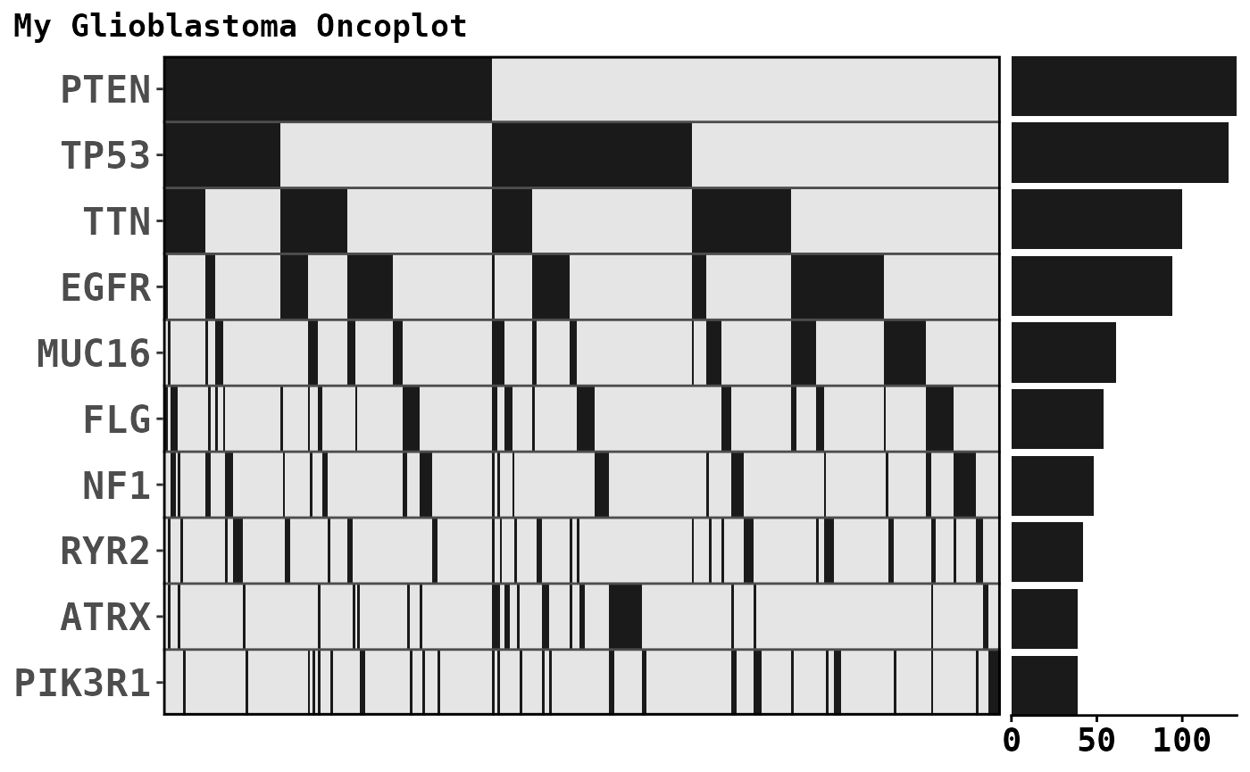
Static plots
gbm_df |>
ggoncoplot(
col_genes = 'Hugo_Symbol',
col_samples = 'Tumor_Sample_Barcode',
col_mutation_type = 'Variant_Classification',
interactive = FALSE
)
#>
#> ── Identify Class ──
#>
#> ℹ Found 9 unique mutation types in input set
#> ℹ 0/9 mutation types were valid PAVE terms
#> ℹ 0/9 mutation types were valid SO terms
#> ℹ 9/9 mutation types were valid MAF terms
#> ✔ Mutation Types are described using valid MAF terms ... using MAF palete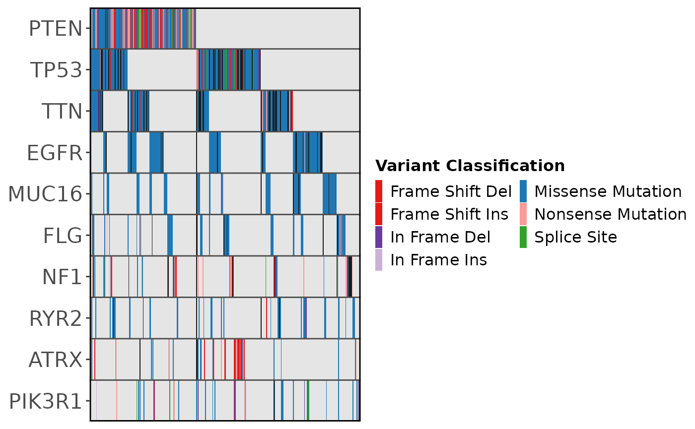
Interaction with other packages
ggoncoplot outputs can be combined with other packages to create interactive multiplots. Here we show how to co-explore mutation oncoplots, expression t-SNE’s & methylation UMAPs.
Install additional packages required to generate interactive multiplots
The following example uses some additional packages:
- express for creating expression plots
- patchwork for combining oncoplot, expression and methylation plots into a single graphic
- ggiraph for making the combined plot interactive
- somaticflags for excluding genes commonly mutated in somatic tissues from the oncoplot.
To install these packages run:
Generate an interactive multiplot
To create an oncoplot that can be interactively coexplored with other
visualisations, set interactive = FALSE so ggoncoplot
returns a ggplot object instead of a ggiraph. Do the same for the
express package which visualises TCGA methylation and expression data
(as UMAPs and t-SNEs. Then you can use patchwork to compose the plots
into a single visualisation make the entire group interactive with data
linked across plots.
# Load required libraries
library(express) # For Creating Expression Plots
library(patchwork) # For combining oncoplot and expression plots
library(ggiraph) # For making combined plot interactive
library(somaticflags) # For excluding genes commonly mutated in somatic tissues
## Create a Breast Cancer Oncoplot
brca_df <- read.csv(system.file("testdata/BRCA_tcgamutations_mc3.csv.gz", package = "ggoncoplot"))
brca_clinical <- read.csv(system.file("testdata/BRCA_tcgamutations_mc3_clinical.csv.gz", package = "ggoncoplot"))
ggoncoplot <- brca_df |>
ggoncoplot(
col_genes = 'Gene',
col_samples = 'Sample',
col_mutation_type = 'MutationType',
topn = 10,
genes_to_ignore = somaticflags,
metadata = brca_clinical,
metadata_palette =
list(
Progesterone = c("Indeterminate" = "gray80", "Negative" = "black", "Positive" = "#DF536B", "[Not Evaluated]" = "grey90"),
Estrogen = c("Indeterminate" = "gray80", "Negative" = "black", "Positive" = "#DF536B", "[Not Evaluated]" = "grey90"),
HER2 = c("Indeterminate" = "gray80", Equivocal = "grey80", "Negative" = "black", "Positive" = "#DF536B", "[Not Evaluated]" = "grey90"),
Classification = c("Ambiguous" = "gray80", "Triple Negative" = "black", "Not Triple Negative" = "#ff0000")
),
options = ggoncoplot_options(
show_genebar_labels = TRUE,
plotsize_metadata_rel_height = 40,
plotsize_tmb_rel_height = 10,
genebar_label_nudge = 20,
fontsize_genes = 11,
fontsize_metadata_text = 11,
show_legend = FALSE
),
interactive = FALSE,
verbose=FALSE
)
## Create a gene expression t-SNE describing the same BRCA cohort
tsne_expression <- express_precomputed("BRCA", datatype = "expression", interactive = FALSE)
## Create a methylation UMAP describing the same BRCA cohort
umap_methylation <- express_precomputed("BRCA", datatype = "methylation", interactive = FALSE)
## Combine plots with patchwork
combined_plots <- (tsne_expression + umap_methylation) / ggoncoplot + plot_layout(heights = c(3.5, 6.5))
# View the interactive version with ggiraph
interactive_multiplot <- girafe(ggobj = combined_plots, height_svg = 6, width_svg = 9)
# Add some settings to choose how to make combined plots interactive
interactive_multiplot <- girafe_options(x = interactive_multiplot,
opts_selection(type = "multiple", only_shiny = FALSE, css = "opacity: 1"),
opts_selection_inv(css = "opacity: 0.12")
)
interactive_multiplotWhy does this work?
ggoncoplot when interactive = FALSE returns a ggplot object with the aesthetics required for ggiraph interactivity baked in (in this case, e.g. the ‘data_id’ is defined by values of col_sample). So long as other packages also produce a data_id aesthetic with matched values (using ggiraph package) + optionally tooltip & onclick aesthetics, then we can use patchwork to combine the plots.
Linking datapoints on custom plots to the oncoplot
You can link data between any custom ggplot and an oncoplot. Follow these steps:
- Create your custom ggplot as usual.
- Replace your geoms with interactive versions from ggiraph.
- Add the
data_idaesthetic, mapping it to the same sample identifiers used in ggoncoplot. - Combine the custom plot and the oncoplot using patchwork.
- Pass the combined plot to the
girafe()function from ggiraph.
This will ensure that the data points are linked between the plots.
Saving your plot
In the current version of ggoncoplot, the download button for the interactive plot downloads a low-resolution image. We recommend the following alternatives for high-quality plots suitable for scientific publications:
To save your non-interactive plot as a 300 dpi PNG, PDF, or SVG, use the
ggsavesfunction from ggsaves.To save your interactive plot in HTML, SVG, or PDF formats (from which high-resolution PNGs can be derived), use the
ggisavesfunction from ggsaves.
Alternatives: - Export the non-interactive graph in any format using
your preferred export method for R plots (e.g., RStudio GUI, or
ggplot2::ggsave()). - Export the interactive graph in any
format using your preferred export method for R HTML widgets (e.g.,
RStudio GUI or htmlwidgets::saveWidget()).