The ggoncoplot R package generates interactive oncoplots to visualize mutational patterns across patient cancer cohorts.
Installation
To install the ggoncoplot package (from R-universe) run:
# Install ggEDA (dependency)
install.packages('ggEDA', repos = c('https://ccicb.r-universe.dev'))

# Install ggOncoplot
install.packages('ggoncoplot', repos = c('https://selkamand.r-universe.dev', 'https://cloud.r-project.org'))
Alternatively, install the development version of ggoncoplot from github:
# Install remotes package (required to install from github)
if (!requireNamespace("remotes", quietly = TRUE))
  install.packages("remotes")

# Install ggoncoplot
remotes::install_github('selkamand/ggoncoplot', build_vignettes = TRUE)
Usage
For complete usage, see the ggoncoplot manual.
Input
The input for ggoncoplot is a data.frame/data.table/tibble with 1 row per mutation in cohort and columns describing the following:
Gene Symbol
Sample Identifier
(optional) mutation type
(optional) tooltip (character string: what we show on mouse hover over a particular mutation)
These columns can be in any order, and named anything. You define the mapping of your input dataset columns to the required features in the call to ggoncoplot.
Basic Example
library(ggoncoplot)

# TCGA GBM dataset from TCGAmuations package
gbm_csv <- system.file(package = "ggoncoplot", "testdata/GBM_tcgamutations_mc3_maf.csv.gz")
gbm_df <- read.csv(file = gbm_csv, header = TRUE)

gbm_df |>
  ggoncoplot(
    col_genes = "Hugo_Symbol",
    col_samples = "Tumor_Sample_Barcode",
    col_mutation_type = "Variant_Classification",
    topn = 10,
    interactive = FALSE # Set to `TRUE` to enable tooltips & cross-linking
  )
#>
#> ── Identify Class ──
#>
#> ℹ Found 9 unique mutation types in input set
#> ℹ 0/9 mutation types were valid PAVE terms
#> ℹ 0/9 mutation types were valid SO terms
#> ℹ 9/9 mutation types were valid MAF terms
#> ✔ Mutation Types are described using valid MAF terms ... using MAF palete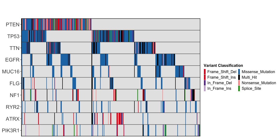
Making oncoplots interactive
To turn on interactive features (tooltips, data-linking, etc), set the argument interactive=TRUE. See the manual for examples of interactive oncoplots, including how to set up data-crosslinking (shown below).
Add marginal plots
gbm_df |>
  ggoncoplot(
    col_genes = "Hugo_Symbol",
    col_samples = "Tumor_Sample_Barcode",
    col_mutation_type = "Variant_Classification",
    topn = 10,
    draw_gene_barplot = TRUE,
    draw_tmb_barplot = TRUE,
    interactive = FALSE
  )
#>
#> ── Identify Class ──
#>
#> ℹ Found 9 unique mutation types in input set
#> ℹ 0/9 mutation types were valid PAVE terms
#> ℹ 0/9 mutation types were valid SO terms
#> ℹ 9/9 mutation types were valid MAF terms
#> ✔ Mutation Types are described using valid MAF terms ... using MAF palete
#> ! TMB plot: Refusing to colour plot since `log10_transform_tmb = TRUE`.
#> This is because you cannot accurately plot stacked bars on a logarithmic scale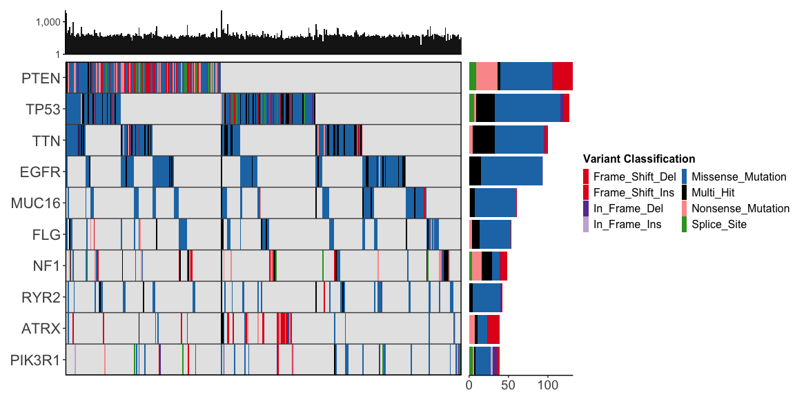
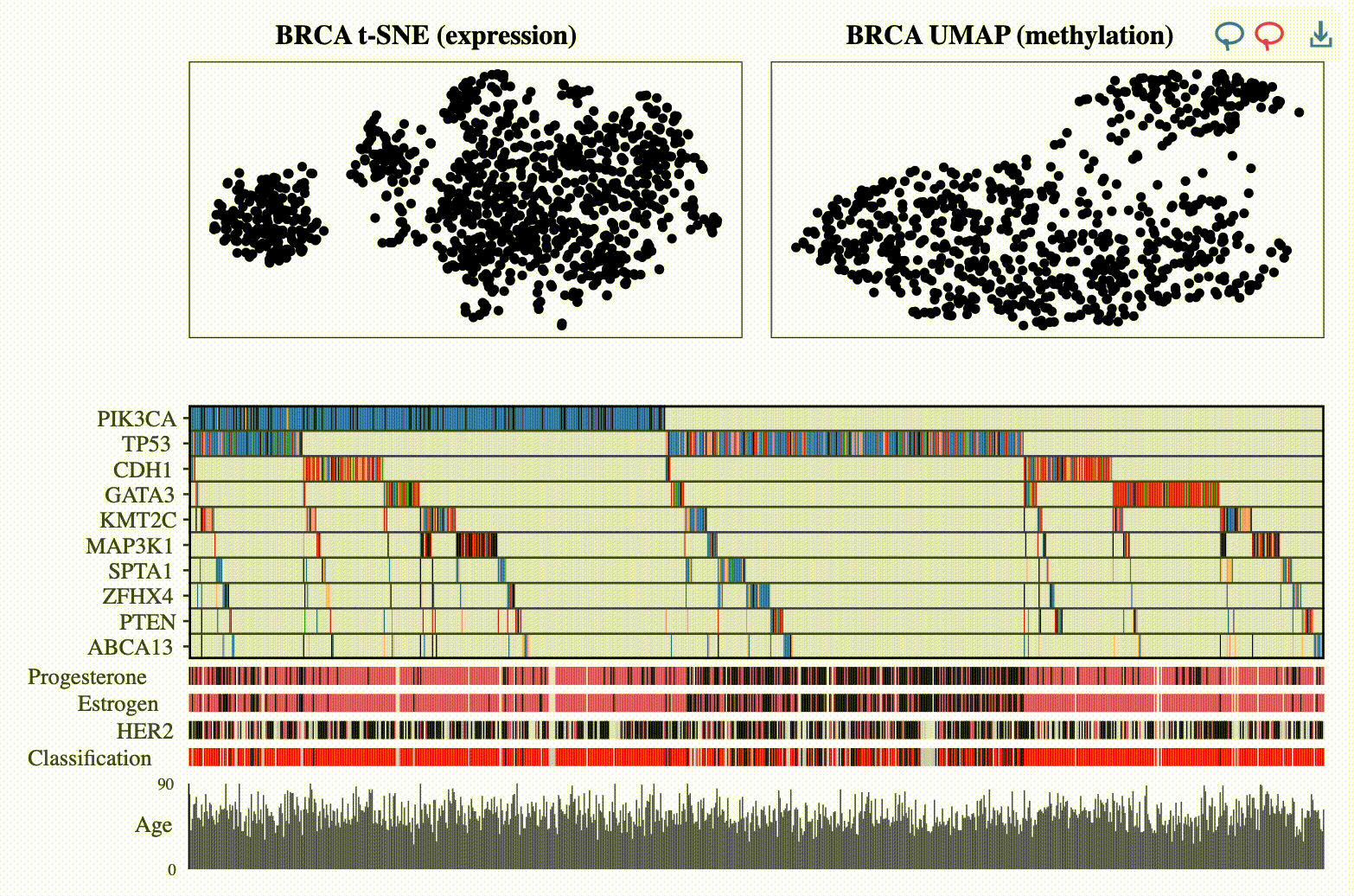
Add clinical metadata
gbm_clinical_csv <- system.file(package = "ggoncoplot", "testdata/GBM_tcgamutations_mc3_clinical.csv")
gbm_clinical_df <- read.csv(file = gbm_clinical_csv, header = TRUE)

gbm_df |>
  ggoncoplot(
    col_genes = "Hugo_Symbol",
    col_samples = "Tumor_Sample_Barcode",
    col_mutation_type = "Variant_Classification",
    metadata = gbm_clinical_df,
    cols_to_plot_metadata = c("gender", "histological_type", "prior_glioma", "tumor_tissue_site"),
    draw_tmb_barplot = TRUE,
    draw_gene_barplot = TRUE,
    show_all_samples = TRUE,
    interactive = FALSE
  )
#> ℹ 2 samples with metadata have no mutations. Fitering these out
#> ℹ To keep these samples, set `metadata_require_mutations = FALSE`. To view them in the oncoplot ensure you additionally set `show_all_samples = TRUE`
#> → TCGA-06-0165-01
#> → TCGA-06-0167-01
#>
#> ── Identify Class ──
#>
#> ℹ Found 9 unique mutation types in input set
#> ℹ 0/9 mutation types were valid PAVE terms
#> ℹ 0/9 mutation types were valid SO terms
#> ℹ 9/9 mutation types were valid MAF terms
#> ✔ Mutation Types are described using valid MAF terms ... using MAF palete
#> ! TMB plot: Refusing to colour plot since `log10_transform_tmb = TRUE`.
#> This is because you cannot accurately plot stacked bars on a logarithmic scale
#>
#> ── Plotting Sample Metadata ────────────────────────────────────────────────────
#>
#> ── Sorting
#> ℹ Sorting X axis by: Order of appearance
#>
#> ── Generating Plot
#> ℹ Found 4 plottable columns in data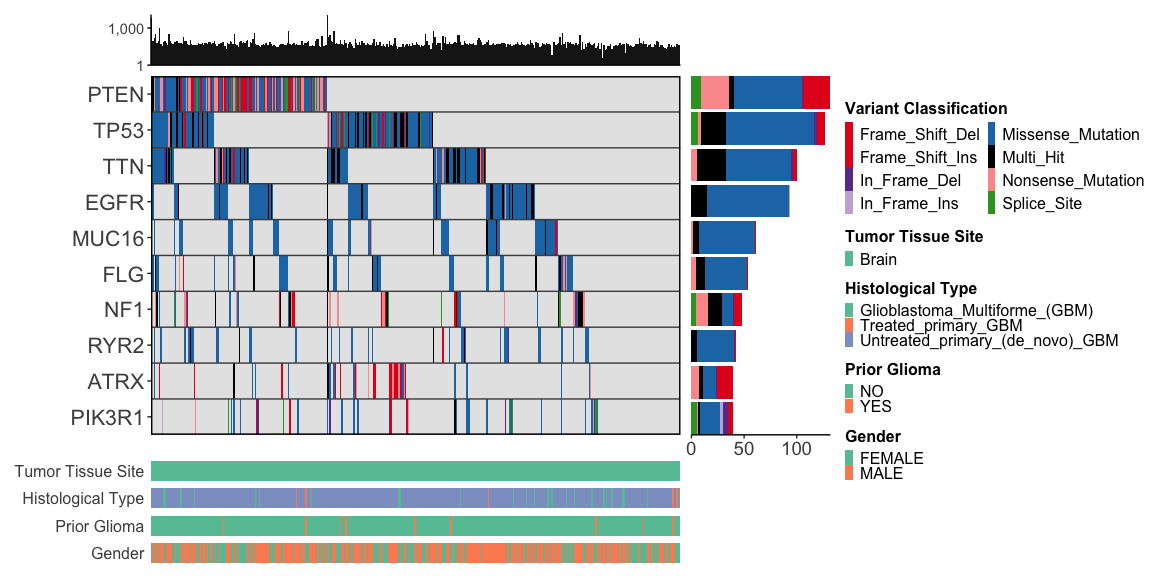
Statement of Need
Oncoplots are highly effective for visualising mutation data in cancer cohorts but are challenging to generate with the major R plotting systems (base, lattice, or ggplot2) due to their algorithmic and graphical complexity. Simplifying the process of generating oncoplots would make them more accessible to researchers. Existing packages including ComplexHeatmap, maftools, and genVisR all make static oncoplots easier to create, but there is still a significant unmet need for a user-friendly method of creating oncoplots with the following features:
Interactive plots: Customizable tooltips, cross-selection of samples across different plots, and auto-copying of sample identifiers on click. This enables exploration of multiomic datasets.
Support for tidy datasets: Compatibility with tidy, tabular mutation-level formats that cancer cohort datasets are typically stored in. This greatly improves the range of datasets that can be quickly and easily visualised in an oncoplot since genomic data in Mutation Annotation Format (MAF) files and relational databases usually follow this structure.
Auto-colouring: Automatic selection of accessible colour palettes for datasets where the consequence annotations are aligned with standard variant effect dictionaries including Prediction and Annotation of Variant Effects (PAVE), Sequence Ontology (SO) and MAF Variant Classifications.
Versatility: The ability to visualize entities other than gene mutations, such as noncoding features (e.g., promoter or enhancer mutations) and non-genomic entities (e.g., microbial presence in microbiome datasets).
We developed ggoncoplot as the first R package to address all these challenges together. Examples of all key features are available in the ggoncoplot manual.
A full comparison of ggoncoplot features with similar tools is available here
Scalability
ggOncoplot can produce its default, interactive oncoplot on even the largest TCGA cancer cohort (Breast Cancer - BRCA) which contains 1026 samples in 0.81 seconds (Macbook Pro; M3 Pro Chip; 18GB ram). Since the number of mutations in a genomic dataset does not change the number of tiles rendered in the final oncoplot, a 10x increase in variant number (1,350,300) takes only 1.3x longer to plot.
Code used for benchmarking is shown below.
library(microbenchmark) # install.packages("microbenchmark")

# Setup Data
data <- read.csv(system.file("testdata/BRCA_tcgamutations_mc3.csv.gz", package = "ggoncoplot"))

# Increase variant count by 10x
data_10x <- do.call("rbind", replicate(n = 10, data, simplify = FALSE))

# Benchmark
microbenchmark(
  interactive = print(ggoncoplot(data, col_samples = "Sample", col_genes = "Gene", col_mutation_type = "MutationType", verbose = FALSE)),
  interactive_10x = print(ggoncoplot(data_10x, col_samples = "Sample", col_genes = "Gene", col_mutation_type = "MutationType", verbose = FALSE)),
  static = print(ggoncoplot(data, col_samples = "Sample", col_genes = "Gene", col_mutation_type = "MutationType", verbose = FALSE, interactive = FALSE)),
  static_10x = print(ggoncoplot(data_10x, col_samples = "Sample", col_genes = "Gene", col_mutation_type = "MutationType", verbose = FALSE, interactive = FALSE)),
  times = 18
)
Limitations
Responsiveness of interactive graphics may slow as the number of tiles in oncoplot (samples x genes increases) especially when tooltips contain large amounts of information. On a MacBook Pro (M3 Pro chip with 18GB of memory) the largest TCGA dataset (BRCA) including 1026 samples can be rendered with sample IDs in tooltip with no noticeable delay in tooltip responsiveness.
Acknowledgements
We acknowledge the developers and contributors whose packages and efforts were integral to the development of ggoncoplot:
-
David Gohel for the
ggiraphpackage, which enables the interactivity of ggoncoplot. -
Thomas Lin Pedersen for his contributions to the
patchworkpackage and the maintenance ofggplot2. -
Hadley Wickham and all contributors to the
ggplot2package, which provides a robust foundation for data visualization in R.
Additionally, we thank Dr. Marion Mateos for her insightful feedback during the early stages of ggoncoplot development.
We also acknowledge Cerami et al. for their early, pioneering development of interactive oncoplots written in javascript, published in Cancer Discovery in 2012 and accessible as a web-app from cbioportal.
Community Contributions
All types of contributions are encouraged and valued. See our guide to community contributions for different ways to help.
Citing ggoncoplot
If using ggoncoplot, please cite this 2025 JOSS paper
citation("ggoncoplot")
#> To cite package 'ggoncoplot' in publications use:
#>
#>   El-Kamand S, Quinn JMW, Cowley MJ (2025). "ggoncoplot: an R package
#>   for interactive visualisation of somatic mutation data from cancer
#>   patient cohorts." _Journal of Open Source Software_, *10*(115), 7390.
#>   doi:10.21105/joss.07390 <https://doi.org/10.21105/joss.07390>.
#>
#> A BibTeX entry for LaTeX users is
#>
#>   @Article{,
#>     title = {ggoncoplot: an R package for interactive visualisation of somatic mutation data from cancer patient cohorts},
#>     author = {Sam El-Kamand and Julian M. W. Quinn and Mark J. Cowley},
#>     journal = {Journal of Open Source Software},
#>     year = {2025},
#>     volume = {10},
#>     number = {115},
#>     pages = {7390},
#>     doi = {10.21105/joss.07390},
#>   }