[!WARNING]
We strongly recommend that you migrate to the ggEDA package, which provides a richer feature set, ongoing maintenance, and enhanced performance. The gg1d package is no longer under active development and will only receive essential bug-fixes.
Effortlessly visualize all columns in a data frame with vertically aligned plots and automatic plot selection based on variable type. Plots are fully interactive, and custom tooltips can be added.
A graphical user interface to all gg1d visualisations is available at https://CCICB.github.io/featurepeeker/
Why 1 dimensional plots?
To understand trends in your data, especially correlative relationships between 2 or more features, it can be useful to densely stack visual representations of each feature vertically, regardless of data type. By unifying the -axis across each plot, gg1d turns a series of 1D plots into an visualization where . Note the key idea of gg1d is to ‘preserve the individual.’ gg1d does NOT plot distributions of properties, but rather each value of a feature for each subject/observation in the dataset.
gg1d can be used for exploratory data analysis (EDA) or to produce publication quality graphics summarizing a dataset.
Installation
install.packages("gg1d")Development Version
You can install the development version of gg1d from GitHub with:
if (!require("remotes"))
    install.packages("remotes")

remotes::install_github("selkamand/gg1d")
Or from R-universe with:
install.packages("gg1d", repos = "https://ropensci.r-universe.dev")Quick Start
For examples of interactive gg1d plots see the gg1d gallery
# Load library
library(gg1d)
# Read data
path_gg1d <- system.file("example.csv", package = "gg1d")
df <- read.csv(path_gg1d, header = TRUE, na.strings = "")
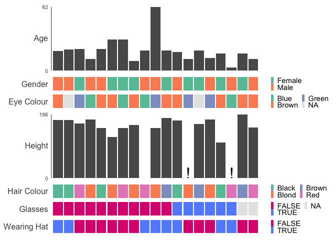
# Plot data, sort by Glasses
gg1d(
df,
col_id = "ID",
col_sort = "Glasses",
interactive = FALSE,
verbose = FALSE,
options = gg1d_options(legend_nrow = 2)
)
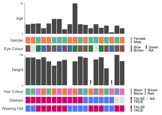
Customise Colours
Customise colours by supplying a named list to the palettes argument
gg1d(
  df,
  col_id = "ID",
  col_sort = "Glasses",
  palettes = list("EyeColour" = c(
    Brown = "rosybrown4",
    Blue = "steelblue",
    Green = "seagreen"
  )),
  interactive = FALSE,
  verbose = FALSE,
  options = gg1d_options(legend_nrow = 2)
)
Parallel Coordinate Plots
For datasets with many observations and mostly numeric features, parallel coordinate plots may be more appropriate.
ggparallel(
 data = minibeans,
 col_colour = "Class",
 order_columns_by = "auto",
 interactive = FALSE
)
#> ℹ Ordering columns based on mutual information with [Class]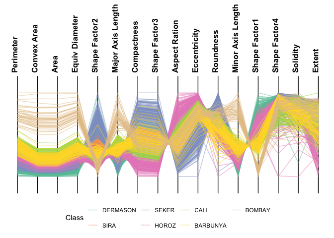
 ggparallel(
   data = minibeans,
   col_colour = "Class",
   highlight = "DERMASON",
   order_columns_by = "auto",
   interactive = FALSE
 )
#> ℹ Ordering columns based on how well they differentiate 1 group from the rest [DERMASON] (based on mutual information)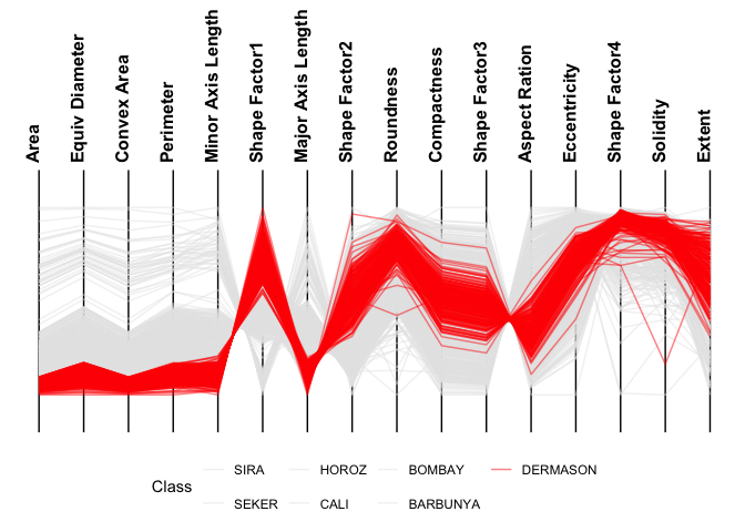
 ggparallel(
   data = minibeans,
   order_columns_by = "auto",
   interactive = FALSE
 )
#> ℹ To add colour to plot set `col_colour` to one of: Class
#> ℹ Ordering columns to minimise crossings
#> ℹ Choosing axis order via repetitive nearest neighbour with two-opt refinement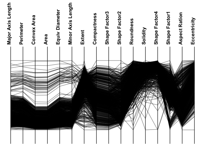
Community Contributions
All types of contributions are encouraged and valued. See our guide to community contributions for different ways to help.